Church of the Harvest needed a generic outreach shirt that communicated their mission while being easily recognizable in their brand identity after their rebrand project. They requested the gold color of their brand for the shirt and their mission statement to be featured. Their inspiration photos included a pocket square placement on the front with a larger and more detailed back. I used their branding guidelines to highlight the logo in a box format, keeping to the sharp angles of the wheat and used the church name and mission statement to sandwich the logo in a clean and modern format.

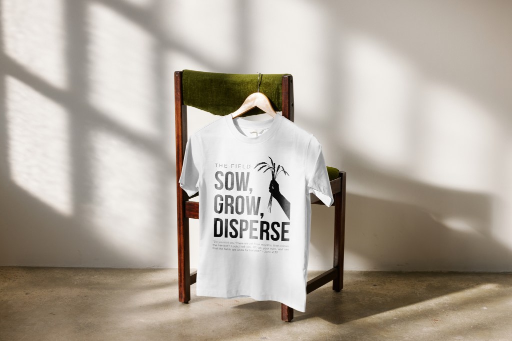
Church of the Harvest requested more modern merchandise for their online store that did not include the main logo, but other important parts of the ministry. The Four Visions were highlighted within the church and I used them to create a shirt for each of the four visions. Keeping within brand standards, the symbols and action point of the vision are surrounded by the vision they represent and the Bible verse they are associated with.